How do we make it inspiring to shop meal boxes online?
Aarstiderne is known for its organic quality vegetables and fruits and their constant focus on sustainability. They were the first Danish company to start selling meal boxes for consumers. What they mastered in producing good quality food, they were lacking in creating a compelling digital experience across their platforms.
Aarstiderne needed a complete redesign of their key website: The meal box shopping experience. It needed to cater for the two different user journeys: new customers and existing customers.


The starting point
The existing website was all but inspiring.
Customers were overwhelmed with buttons to find the variant that would fit their needs. A good example showing that less clicks on a website is not always the best.
Card sorting exercise
Internally we did a card sorting exercise to rank what elements shown on the website was most important. We did this for both existing customers and new customers.
We had representatives from support and marketing to help us out as they had conversations with our customers on a daily basis.

Concepts
I started by interviewing existing customers to get a sense of how they used the website. Before we talked to new customers we wanted to show them a number of different concepts instead of just showing them the old website. We wanted to do this to get feedback about, what they were looking for when shopping for meal boxes. By showing them multiple concepts, we could get an idea about what worked and what wouldn't help them.
Based on the card sorting exercise we did an internal creative workshop, where we came up with 7 different concepts. Below are a snippet of those.


Narrowing down the concepts
Showing 7 concepts to users can be overwhelming and time consuming. Therefore we had an internal workshop where we went through pros and cons for each concept.

We narrowed down the concepts to 3 new concepts, by combining the best ideas with the best overall structure.
We then showed these final concepts to customers.

“
I think the concepts are easy to navigate, but to be honest, they are a bit boring"
A new customer testing the 3 final concepts. This sparked an idea to get more creative with the photos for the final website.
The new and improved Aarstiderne.com
It was clear which concept gave the best overview of meal boxes, and when customers where given the choice to see either the cheapest or the most green boxes, their choice was narrowed down to 3-4 boxes. This made it easier to compare the different menus from week to week and select the box they preferred.
We worked hard to create even better photos to represent the ingredients, style and flavour for each individual box.
Based on the user feedback the page had to "pop" and focus should be on the meal boxes.
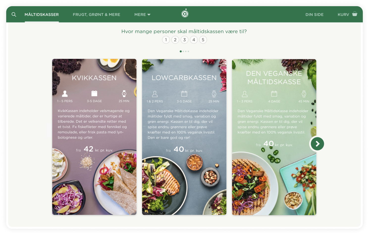
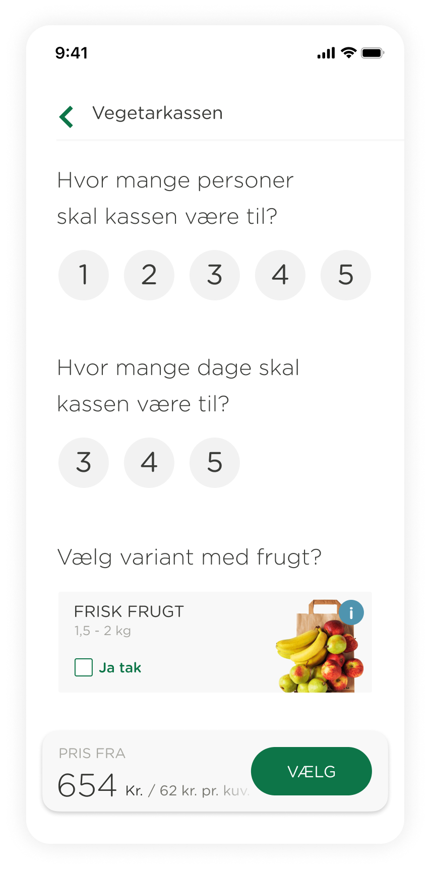
Selecting the size of the box, number of days and additional extra purchases, where added to the flow after the customers had been inspired. This made it very simple to complete the purchase.


Additional info, menu of the week and the exact content of the box was hidden behind tabs to prevent overloading the user with information.
Learnings
I left Aarstiderne before the final design was launched, and I therefore missed out on a big part of the design process: tweeking all the little details that can be improved once the site goes live.
We tracked many data points to ensure we could choose the designs or flows that would perform best.
From a design and accessibility point of view, one thing I would have changed, if I had the option was to make the text on the photos easier to read. Some of the photos had very light colored backgrounds and with white text it could be a challenge to read for some users.
Cases

PlandayProduct Design

AarstiderneProduct Design